GUILTY magazine

GUILTY magazine (2021, GLU) is a magazine that focuses on how to make the best of life – especially during a pandemic. The articles in the magazine are about music, lifestyle, fun activities to do during the pandemic, and more. Because the magazine is all about fun and enjoyment, I’ve decided to use funny, messy looking illustrations to create a playful vibe. 

Check out the page “Illustrations” for a close up of GUILTY illustrations.

CREALLURE

Creallure (2021, GLU) is a symposium about typography. For this design I’ve designed the letters of the words science and art. Each letter is individually designed, printed out and photographed. The different shades of white and grey in the background of the letters are from different types of lightning. I wanted to capture the endless possibilities and variations of typography. Each letter has been individually placed, to make sure there is a playful ensemble.

Blauwe Muren

“Blauwe Muren” (“Blue Walls”) is the name of my own (Dutch) poetry bundle, which I released on March 10th 2022. The poems in this bundle are written through the years, and have been carefully selected. They are about everything that happens in life. About grief, loss, heartbreak and sadness but also about love, happiness, joy and enjoying the little things.


I’ve designed the cover illustration, which is a simplified illustration of a part of my bedroom. The title “Blauwe Muren” is about the color of the walls of my bedroom. Most of the poems are written within the safety of my bedroom walls, hence the name and the cover illustration. The overall cover (front and back) is designed by the people working at the publishing company that published my book; Boekscout. 


Check out the page “More about Marit” to read a few poems.


Here’s the page about my book on the website of Boekscout.

Lindenberg

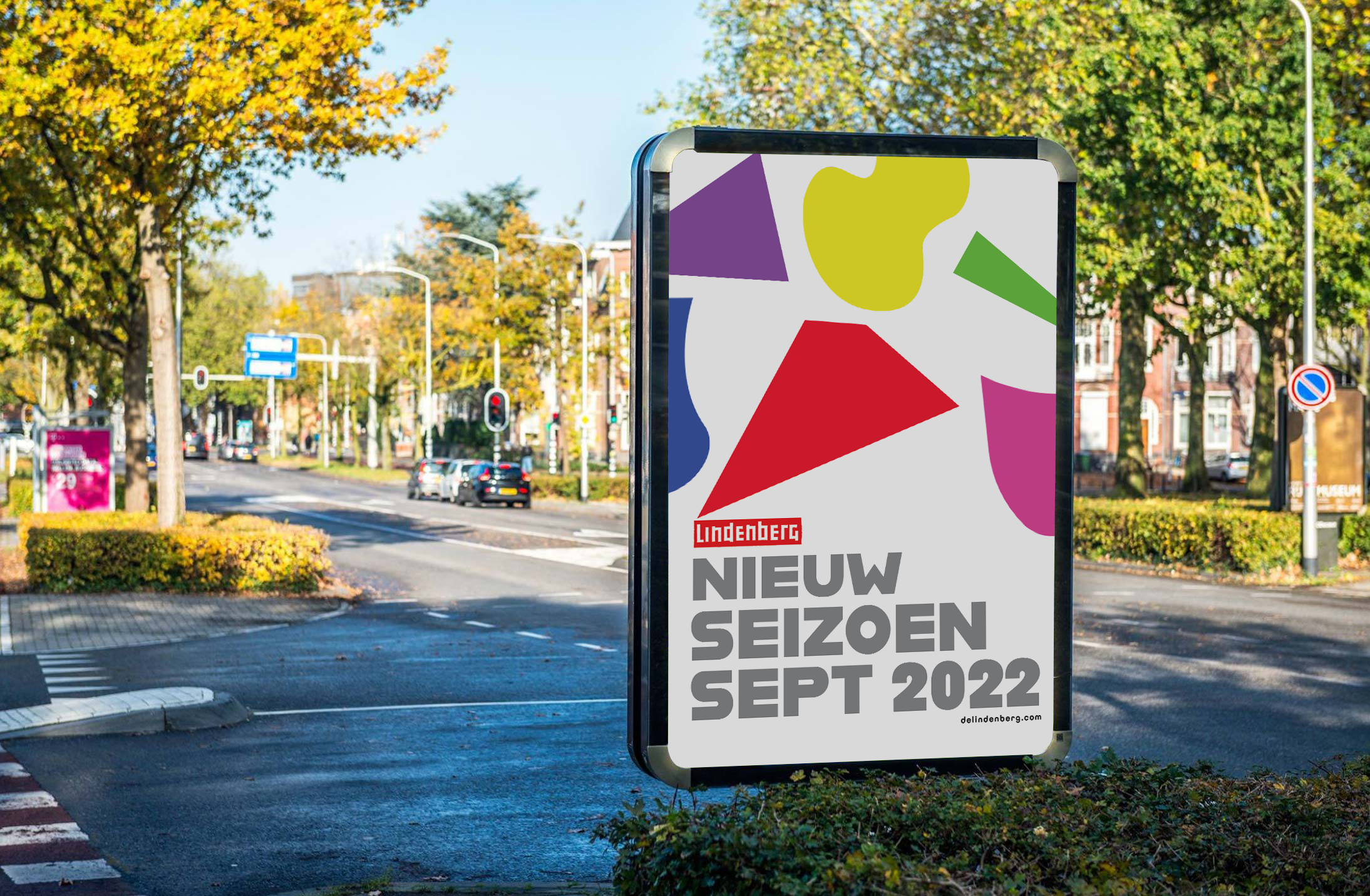
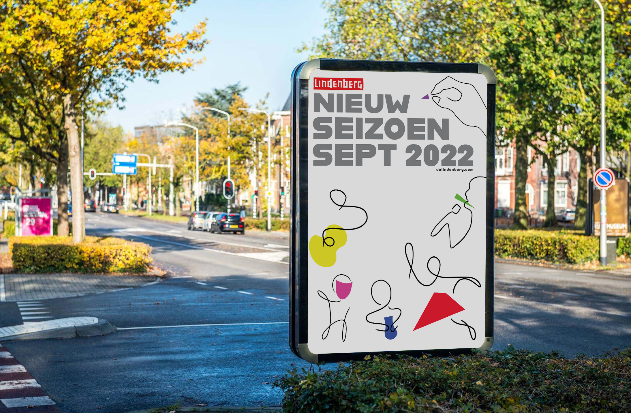
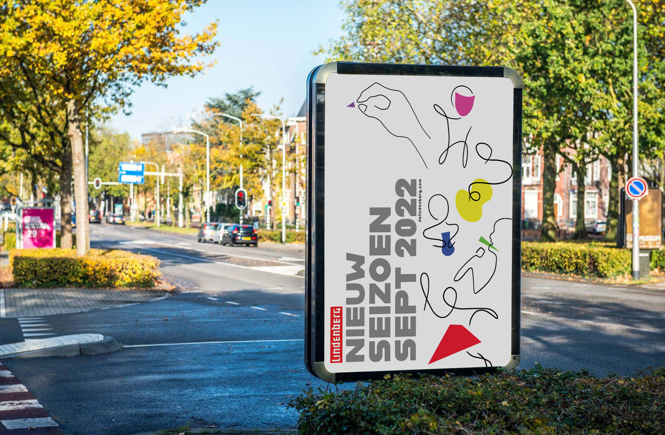
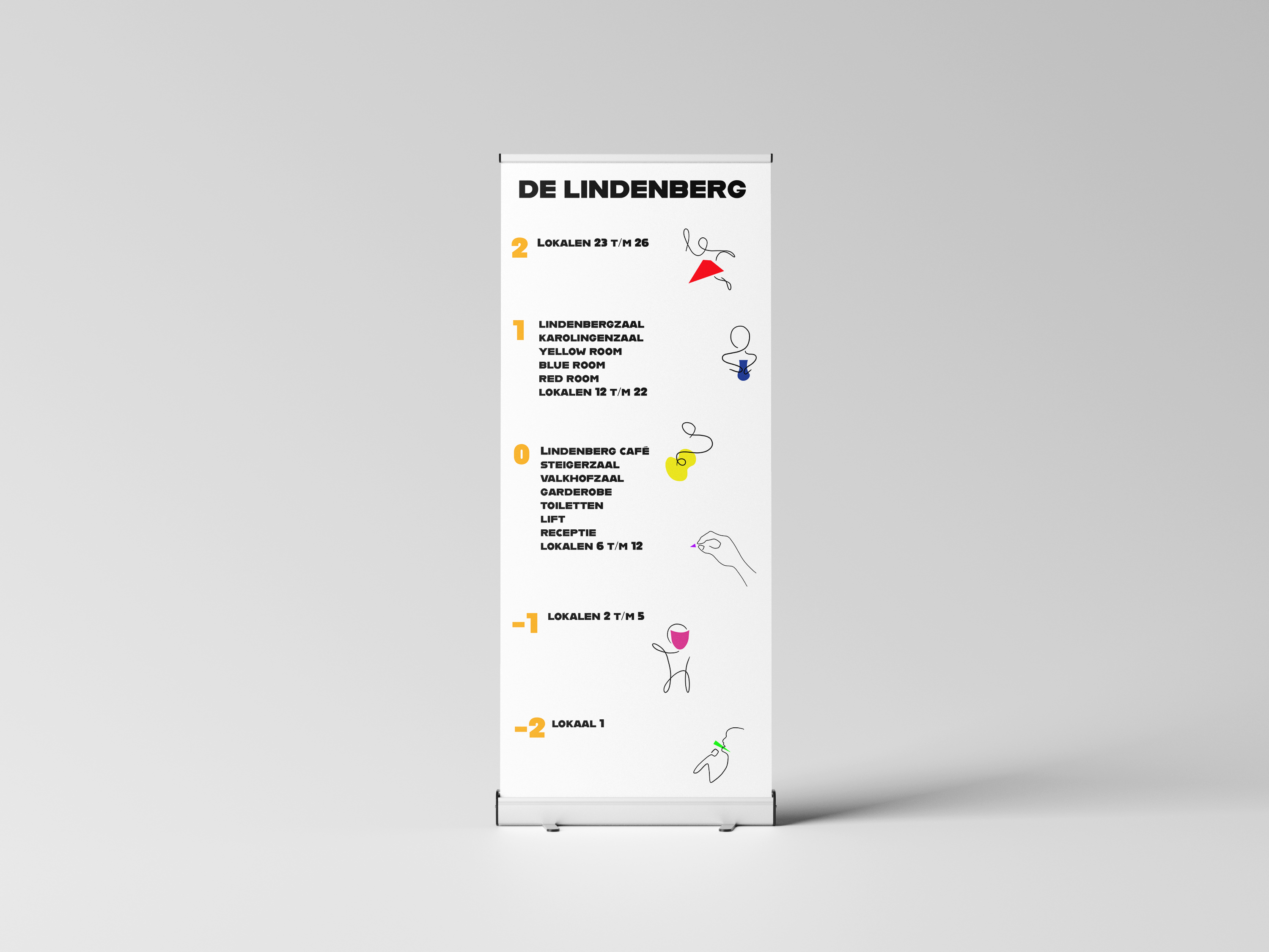
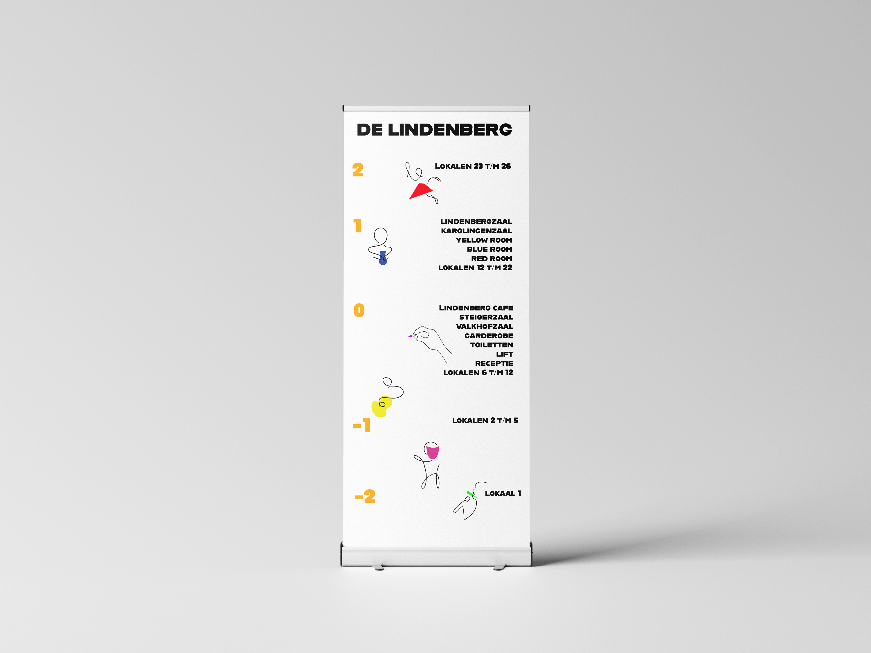
During my first internship at Doorrood (January 2022 – July 2022), it was mandatory to write about your experiences. My supervisor wanted to set up an assignment that was about my passion and my interests, not just something I had to make for college. We concluded it would be a great opportunity for me to create illustrations for a company I knew. I picked De Lindenberg, which is a “house for culture”, that provides all sorts of creative workshops and courses. The challenge was to create illustrations that were playful, colourful but not childish. The illustrations were made to help people who are visiting De Lindenberg find their way. I chose the six kinds of workshops and courses they offer: theatre, music, singing, crafts, writing and dance. 


The illustrations are all drawn in one single stroke. To get the right shape, I used yarn to “map out” the lines, which was a fun experience. Based on those lines, I created digital illustrations and combined those with colourful shapes. These shapes can be used on their own as well.

ALLES IS KUNST IS ALLES

This is a personal project I set up (2022). I wanted to experiment with typography, to see the opportunities I could explore. Alles is kunst is alles is Dutch and directly translates to All is art is all. To me, this sentence is about the fact art can be found everywhere, and anyone can create art. It’s about looking at the world and seeing a beautiful constellation of different pieces of art. 


All is art. Art is all. Alles is kunst. Kunst is alles.

QUEST FOR THE FUTURE

As part of every internship we do, we are required to write about our experiences and about what we learned. During my second internship (August 2022 – January 2023) I created QUEST FOR THE FUTURE. An adventure story in which you follow the journey of an original character. In this story, my internship is the journey. 


I created original characters and an original world for this project. QFTF follow half-elf Neia and her trusty companion Dandelion the frog on their journey through the Land of Elaín. Their goal is to reach the city Crúthu, where a boat called The Future is waiting, which will take you to new places and adventures.


Check out the page “Illustrations” for a close up of QFTF illustrations.